Appearance
Document Styling
Liii STEM supports various typesetting features. This guide will help you understand and use the relevant functions.
Line Breaking
Line Breaking Algorithm Selection
Liii STEM provides two line breaking algorithms: Global Algorithm and First Fit Algorithm, with Global Algorithm being the default. You can change the algorithm used by:
- Click
Document->Paragraph...in the menu bar - Click
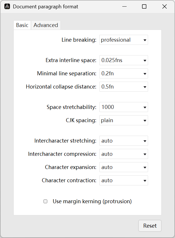
Advanced, then selectProfessionalorStandardunderLine breaking algorithm, where Professional corresponds to Global Algorithm and Standard corresponds to First Fit Algorithm.
Hyphenation Handling
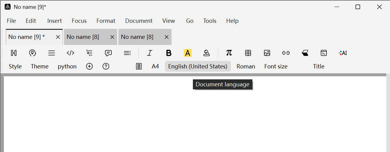
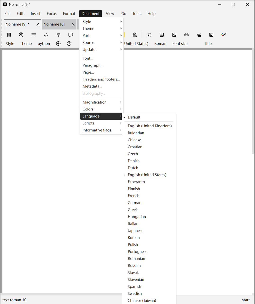
Different languages have significantly different hyphenation rules. If you need to specify the correct language for your document, you can click Document -> Language in the menu bar or directly modify the desired language in the Focus Toolbar.
If you need to modify the language locally, you can click Insert -> Language in the menu bar to insert text in different languages locally.
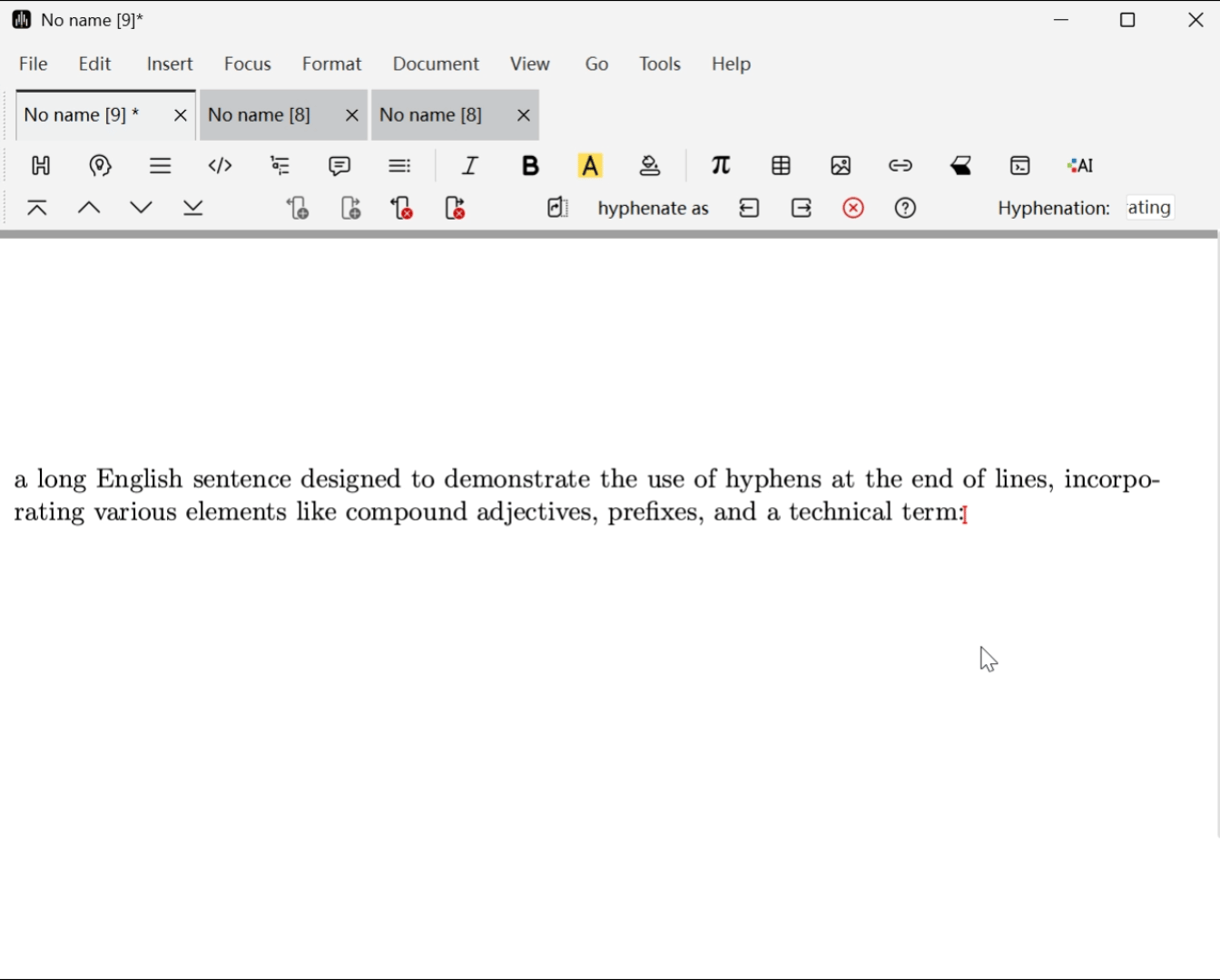
If you want to manually modify the hyphenation of a specific word, you can select the word with the mouse, click Format -> Hyphenate as, and when prompted, insert "-" characters at positions where hyphenation is allowed.
Manual Line Breaking
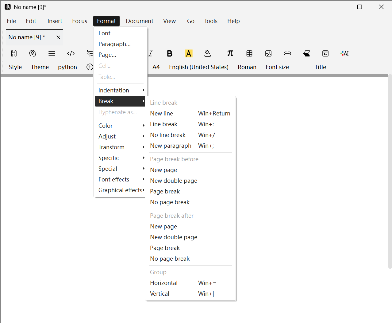
- You can use
Format->Break->New lineto insert a new line, which will make the typesetting program start a new line without stretching the current line to its right border. - You can also use
Format->Break->No breakto prevent line breaking. - If you need to completely prevent line breaking within a given text area, you can select the non-breakable text and click
Format->Break->Horizontal. This method is particularly useful for preventing line breaks within mathematical formula subexpressions. - Additionally, you can insert Non-breaking Space by holding
Spaceand pressingTabto prevent text from being separated during line breaks. Similarly, you can insert non-breaking hyphens by holding-and pressingTab.
Microtypography
Microtypography refers to a series of methods used to improve text readability and appearance, including the following features:
- Kerning
You can adjust this through Format -> Paragraph... -> Advanced -> Intercharacter stretching. For example, when set to 0.05, each character's width can increase by up to 5%.
- Glyph Expansion and Contraction
You can control this through Format -> Paragraph... -> Advanced -> Character expansion and Character contraction. You can also manually scale fonts horizontally using Format -> Font effects -> Magnify horizontally.
- Margin Kerning
This feature uses optical alignment rather than mechanical alignment to make text edges more aesthetically pleasing. You can enable this feature through Format -> Paragraph... -> Advanced -> Use margin kerning (protrusion).
Page Breaking
Page Breaking Algorithm Selection
Similar to line breaking, Liii STEM also provides First Fit and Global algorithms for page breaking. You can select them by clicking Document -> Page... -> Breaking -> Page breaking algorithm -> Rough and Professional, with Global Algorithm being the default.
Controlling Page Breaking Effects
If you want to finely control page breaking effects, you can modify relevant global style variables in the following ways:
- Click
Document->Page...->Breakingin the menu bar - You can set the amount of space that the default page height can be reduced or extended in
Allowed page height reductionandAllowed page height extension - You can increase or decrease the flexibility of stretchable space in
Vertical space stretchability

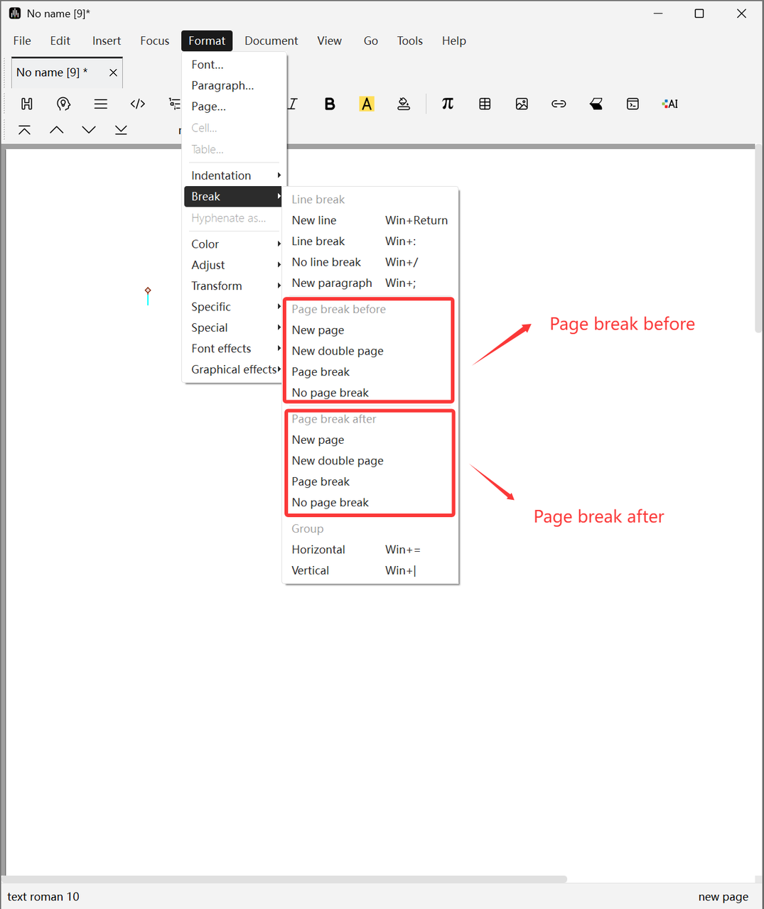
Controlling Page Break Positions
As with line breaking, you can force or prevent page breaks at specific points in the document. Such instructions are indicated by markers. You can also specify whether the instruction should take effect before or after the line where the marker is located. Specific methods are as follows:
- You can use
Format->Break->New pageto insert a new page. - You can also use
Format->Break->No breakto prevent page breaking.
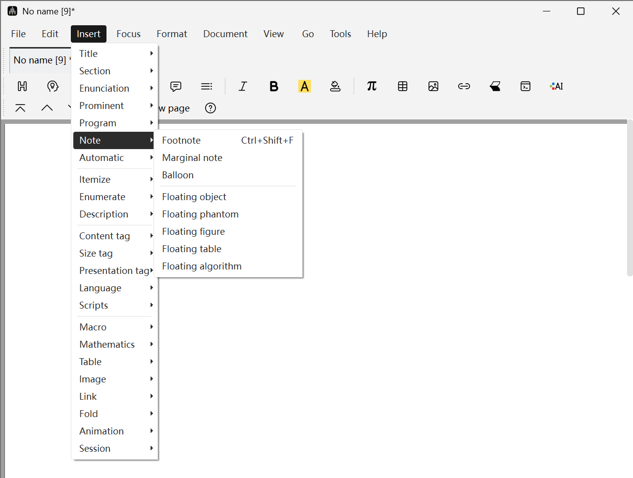
Multi-Text Flow Management
Multi-text flows include footnotes, marginal notes, and floating graphics or tables. You can select the text flow you want to insert by clicking Insert annotation or floating object in the Mode Toolbar.
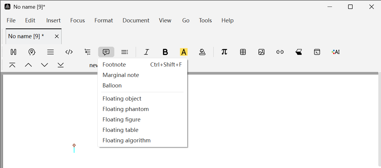
You can also achieve this by clicking Insert -> Annotation in the menu bar.
Footnotes and Marginal Notes
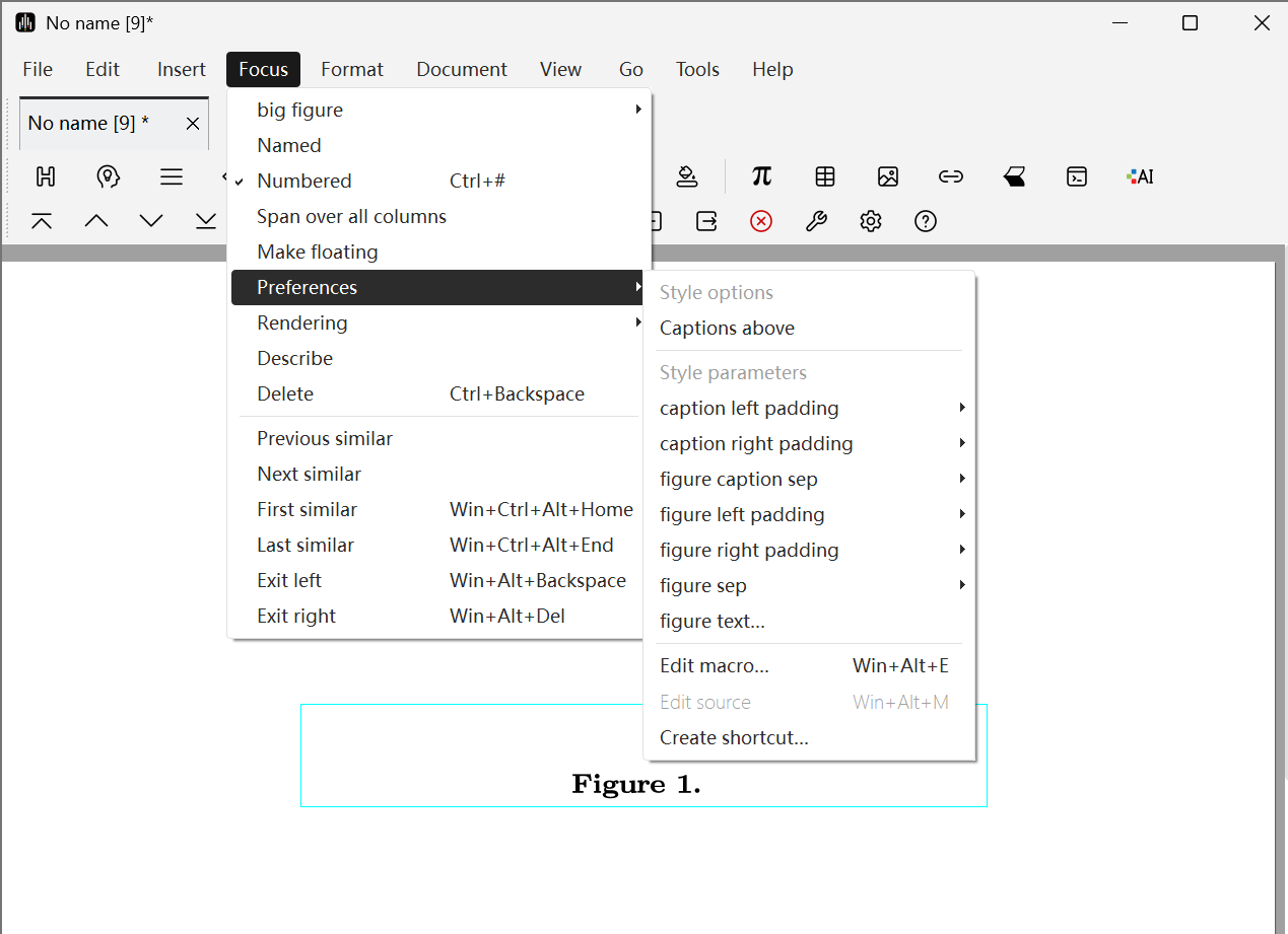
After inserting footnotes, they will be numbered. You can jump between the main text and footnotes by clicking the numbers. If you want to modify the footnote style, move the cursor after the number, then click Focus -> Preferences in the menu bar to select the corresponding style for modification. Specific functions include:
- footnote sep: Footnote separator (sets the style or spacing of the separator line between main text and footnotes)
- locus color: Focus color (sets the color for focus or highlight display)
- page float sep: Page floating object spacing (sets the spacing between floating objects and surrounding text on the page)
- page fnote barlen: Page footnote bar length (sets the length of the horizontal line above footnotes)
- page fnote sep: Page footnote spacing (sets the spacing between footnotes and other content on the page)
- visited color: Visited color (sets the color for visited links)
However, please note that basic footnotes are only effective in normal text flow. If you want to insert footnotes in tables or other special markers, you can click Insert -> Link -> Text for note or Reference to note in the menu bar. These menu items allow you to place footnotes and their corresponding references anywhere in the text.
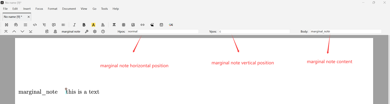
Marginal notes are similar to footnotes, but appear more prominently in the page margins next to the main text, though their width is very limited. If you want to modify the style parameters of marginal notes, you can edit their horizontal position, vertical position, spacing, and width through the Focus option in the menu bar. Specifically, regarding horizontal alignment, you can force them to be placed in the "left" or "right" page margins, or decide based on the parity of page numbers. If the left and right margins of left and right pages are different, marginal notes will be placed in the largest page margin.
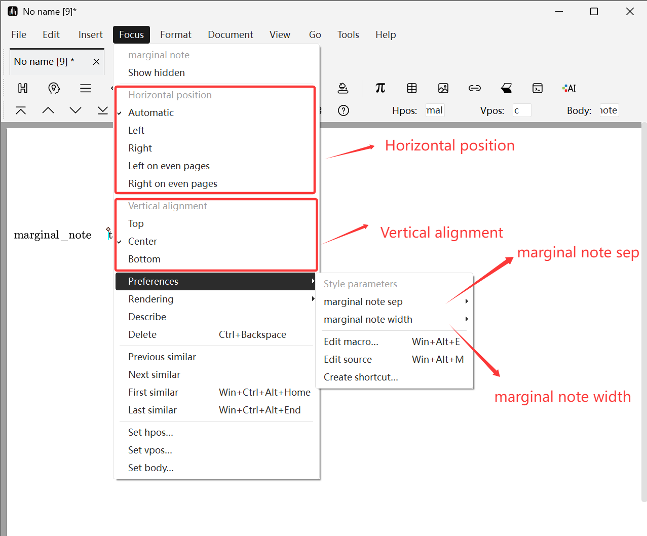
You can also edit marginal notes through the Focus Toolbar, where Hpos is the horizontal position of the marginal note, Vpos is the vertical position of the marginal note, and Body is the content of the marginal note.
Floating Graphics and Tables
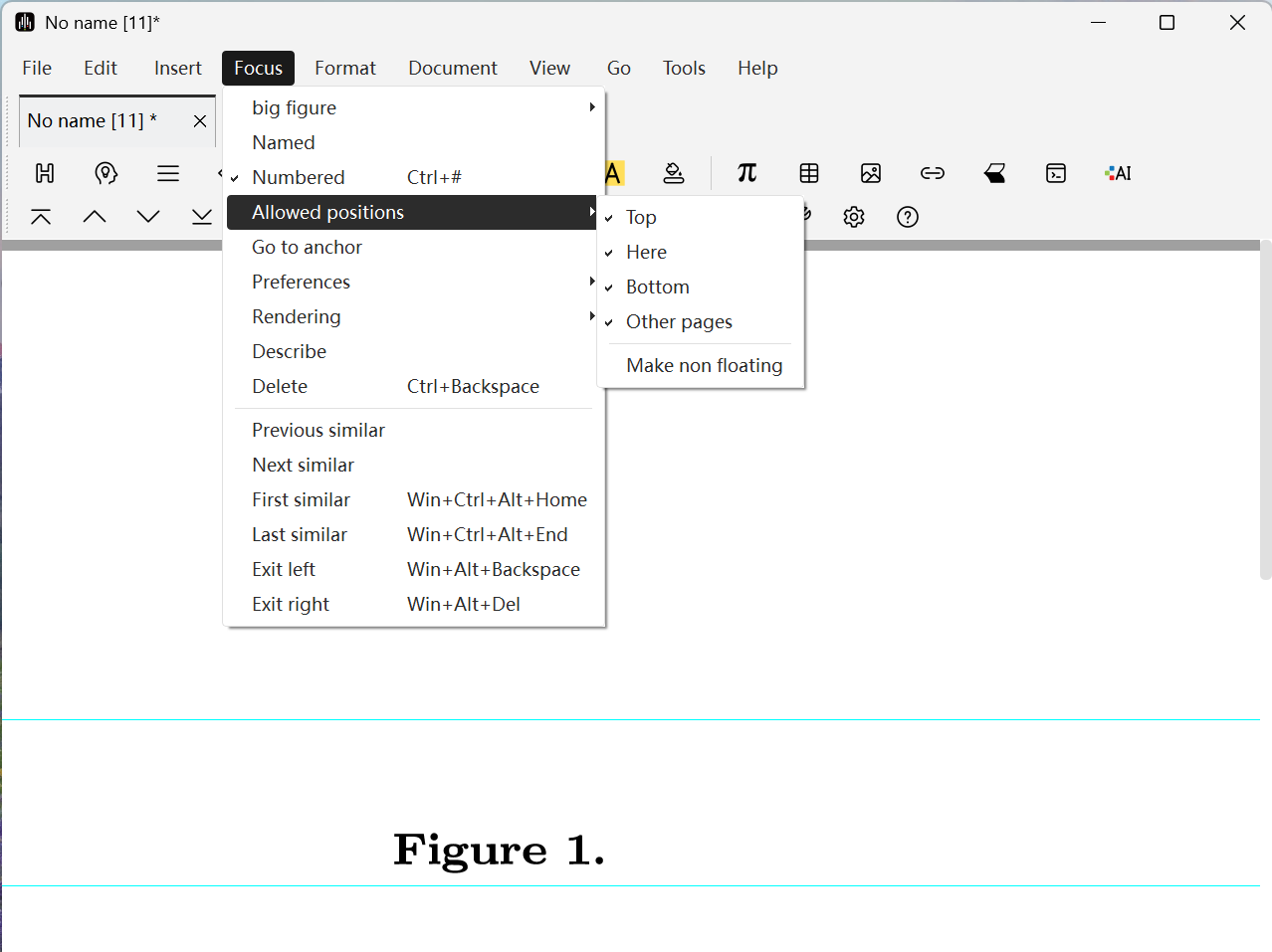
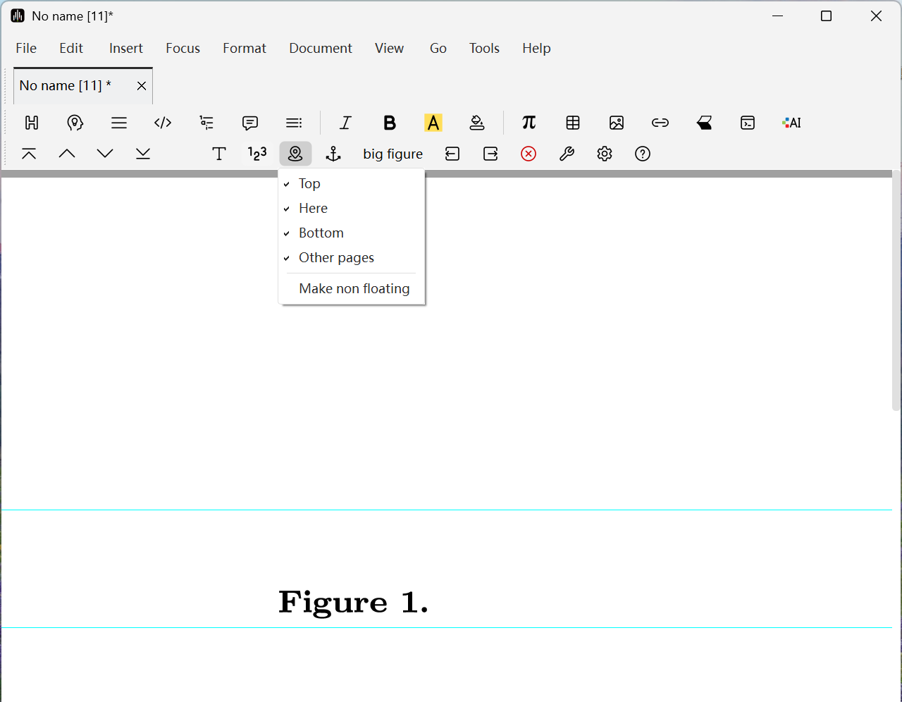
Using floating graphics or tables allows the software to automatically adjust positions to avoid page whitespace. The exact positions allowed for floating can be specified using Focus -> Allowed positions or Allowed positions of floating object in the Focus Toolbar.
Other style parameters can be changed using Focus -> Preferences -> Page floating spacing. Taking floating images as an example:
- caption left padding: Sets the left padding spacing of caption text.
- caption right padding: Sets the right padding spacing of caption text.
- figure caption sep: Sets the vertical distance between the figure and its caption.
- figure left padding: Sets the blank spacing between the left side of the figure and the page or other elements.
- figure right padding: Sets the blank spacing between the right side of the figure and the page or other elements.
- figure sep: Sets the vertical distance between the figure and surrounding main text.
When editing floating objects, you can jump to the corresponding anchor point by clicking the icon or Focus -> Go to anchor. Conversely, if the cursor is right after the anchor point, clicking one of these buttons will position the cursor at the starting position of the floating object.
Multi-Column Styles
You can specify the number of columns for the entire document or selected text areas by clicking Document -> Paragraph -> Number of columns and Format -> Paragraph -> Number of columns in the menu bar. Two-column layout is the default setting for several standard document styles. The separation spacing between columns can be specified using Document -> Paragraph -> Column spacing.
The typesetting program will balance the heights of adjacent columns as much as possible. For long columns from the top to bottom of the page, this is roughly the same as ordinary page breaking. The height balancing effect is most noticeable on the last page or when the number of columns changes on the same page. In multi-column format, footnotes appear at the bottom of columns (not at the bottom of the page).
Similarly, the typesetting program tends to move floating objects to the top or bottom of the same column. If you want to choose a different number of columns for footnotes or floating objects, you can click Format -> Paragraph in the menu bar and set Number of columns -> 1. Wide footnotes and floating objects created in this way always appear at the top or bottom.

Fine Adjustments
Controlling Spacing
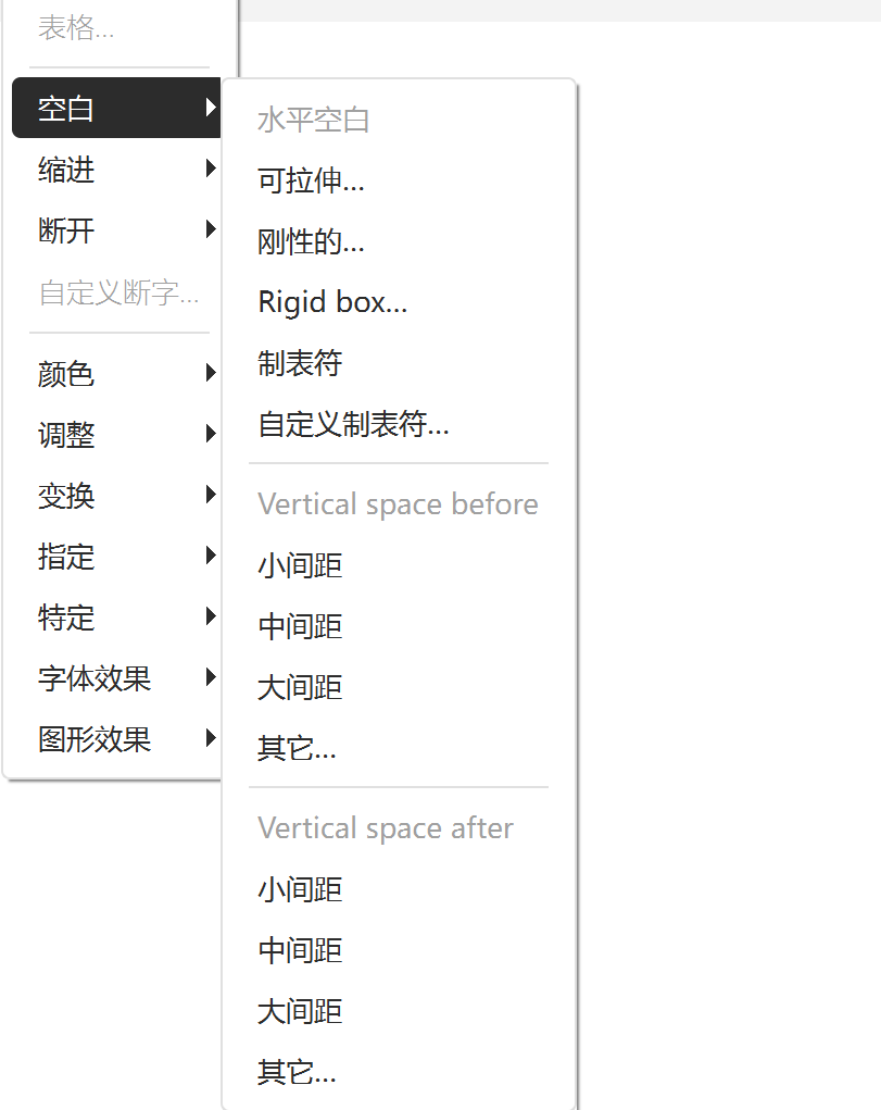
If you want to insert blank areas to control spacing, you can find available space types in Format -> Space items, where you can add horizontal spaces and vertical spacing.
For fine-tuning line spacing within text or formulas, it is recommended to use one of the following length units:
- spc. Width of the space character in the current font;
- fn. Design size of the current font, with half the flexibility of that size;
- em. (Fixed) width of the "M" character in the current font, also known as "full-width space".
The advantage of these units is that they tend to be proportional to font size, so if you change the font size, your adjustments will still be effective.
The default vertical line spacing between lines can be set through Document -> Paragraph... -> Interline space.
You can also specify additional spacing between consecutive paragraphs using Document -> Paragraph... -> Paragraph spacing. Another way to indicate the start of a new paragraph is to indent its first line; in this case, you can set the paragraph spacing to zero and use Document -> Paragraph... -> First line indent to control the exact amount of indentation.
Adjusting Formula and Text Positions
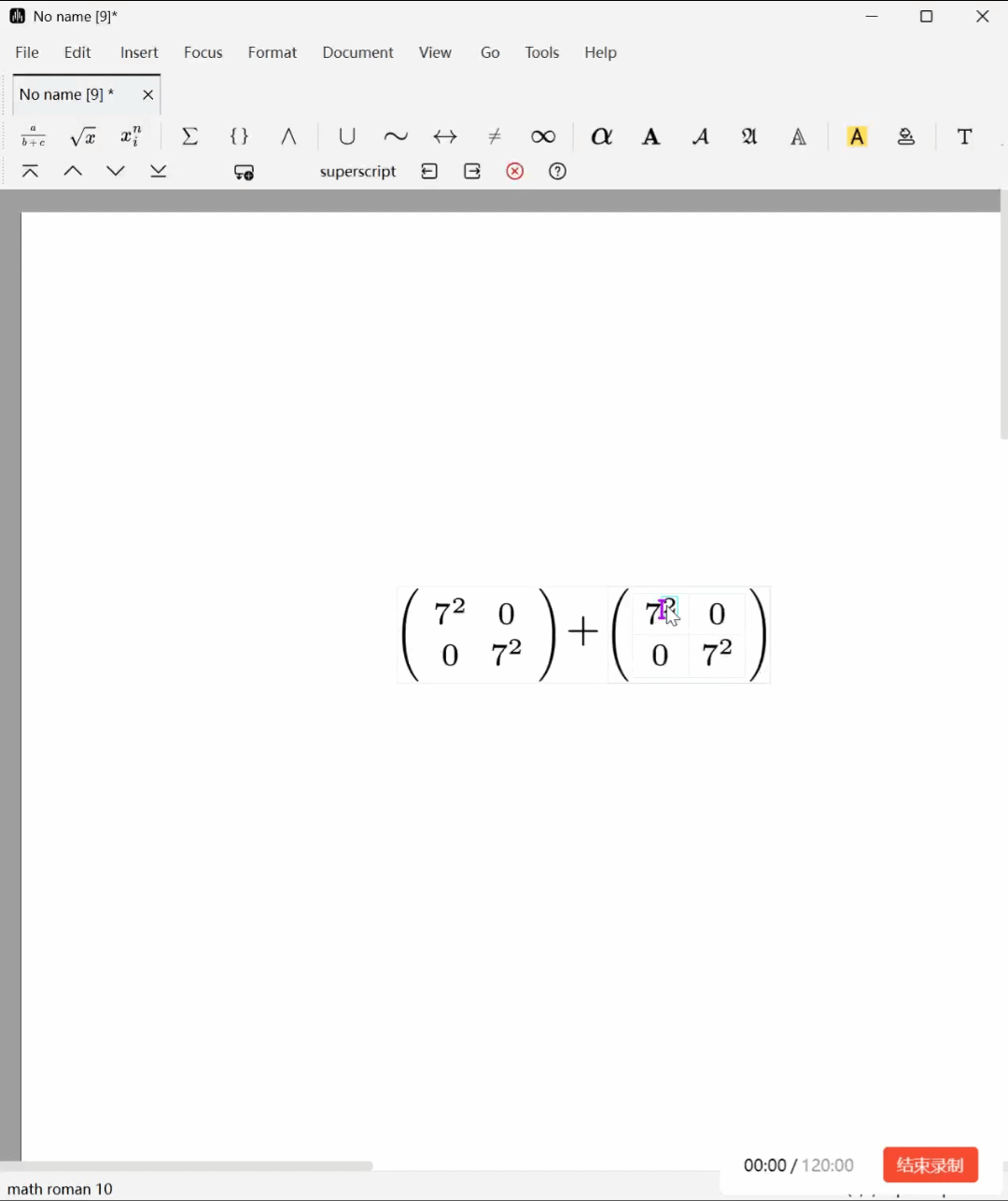
When editing formulas with characters of different heights, external parentheses may become inconsistent in size, affecting aesthetics. In this case, you can select the characters you want to adjust and use the items in Document -> Adjust in the menu bar for modification. The functions of different options are as follows:
- Move: Move a subformula both horizontally and vertically. Can be used for fine-tuning or creating special effects.
- Shift: Similar to
Move, but the key difference is: Shift does not change the space layout occupied by the object itself, and the surrounding text typesetting is not affected. It only displays the object in another position. - Change size: Explicitly modify the boundaries (left, right, top, bottom) of a piece of text without changing its display content.
- Extend: Similar to
Change size, but specifies increments relative to the default range. - Clip: Similar to
Change size, but clips the text to the specified bounding box. - Smash: Makes a character appear unchanged but tricks the typesetting system into thinking its vertical height is the same as another baseline character. This is the fastest way to solve the aforementioned parenthesis problem.
- Reduce: Explicitly reduces the vertical extension range of a character.
- Inflate: Opposite of
Smash, expands the vertical range of a character to reach the height of the largest character in that font.
The figure below shows an example of adjusting character height:
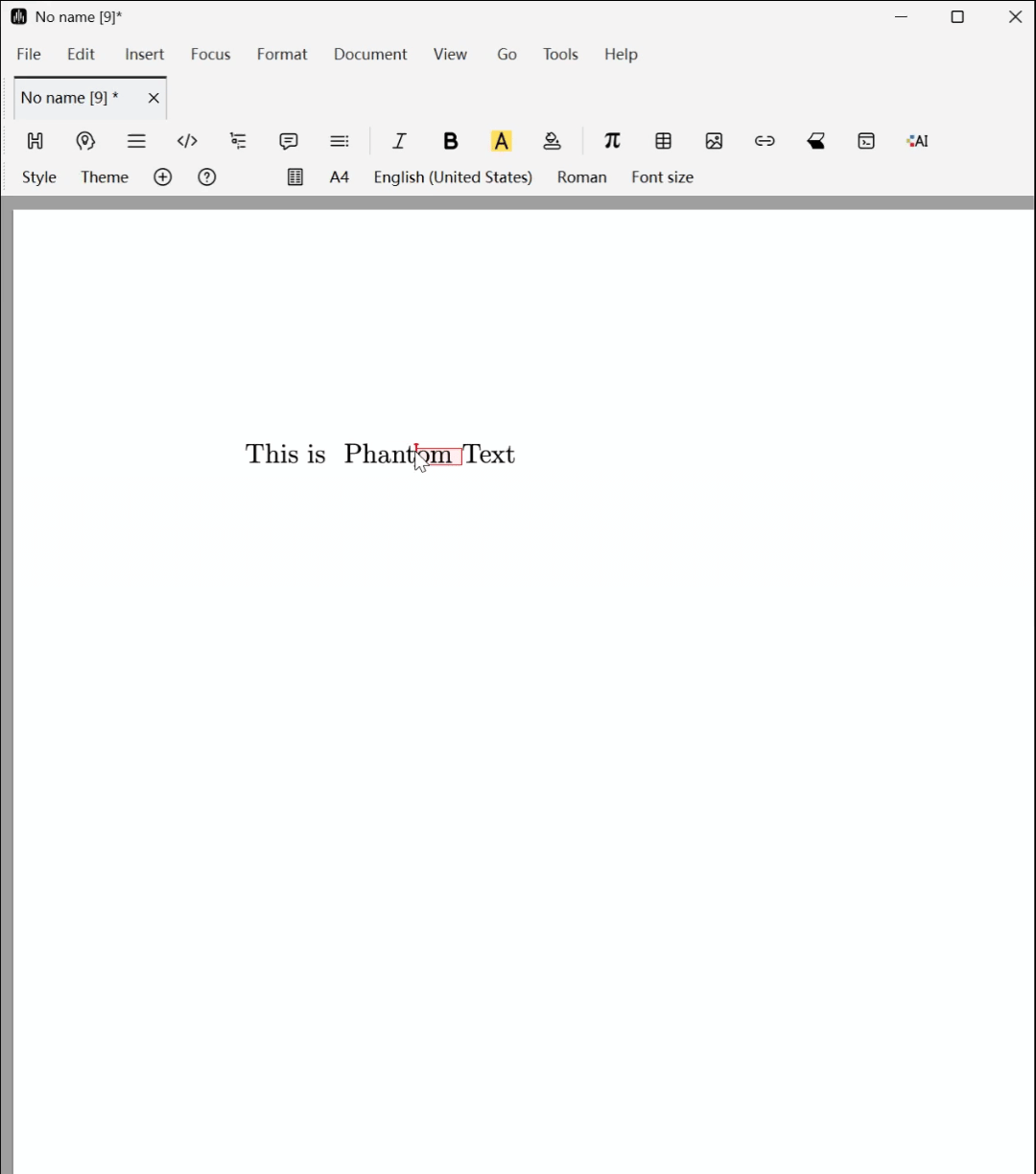
Phantom Text
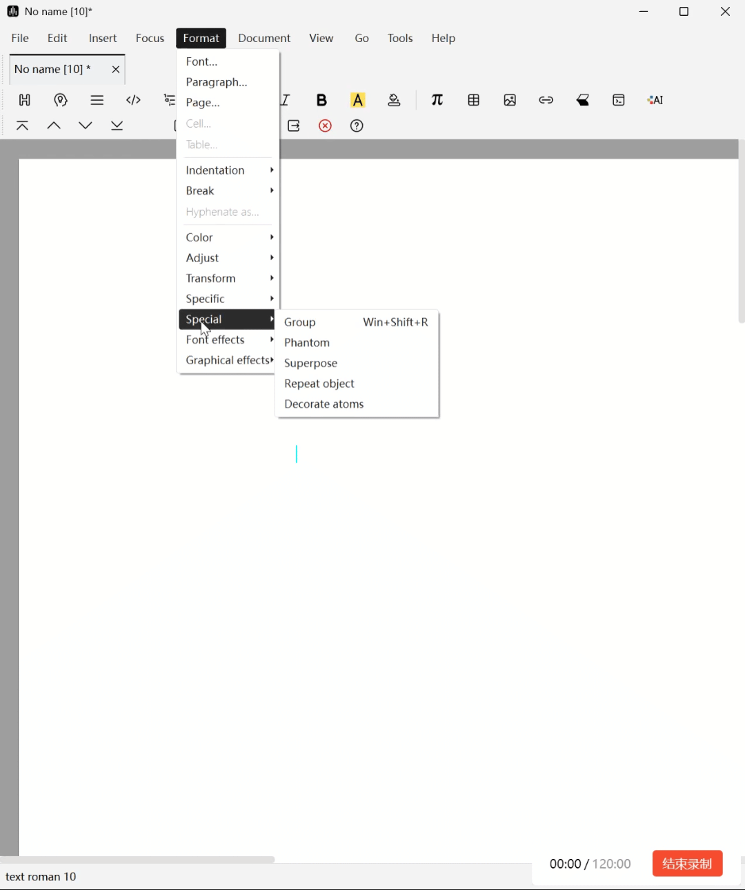
Phantom Text is invisible but placeholder text used for precise adjustment and alignment of visible elements. You can convert a piece of text into phantom text by selecting it and clicking Format -> Specific -> Phantom in the menu bar.
Font and Graphic Effects
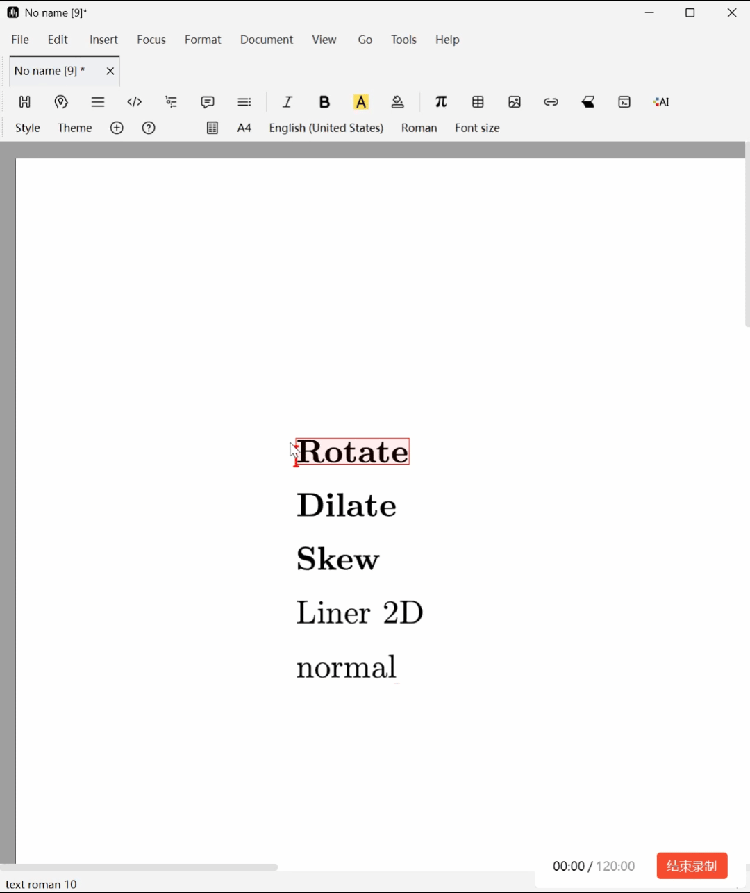
Linear Transformations
Using items in Format -> Transform, you can apply various linear transformations to selected text blocks: Rotate, Vertical scaling (Dilate), Skew, and general 2×2 matrix transformations. The corresponding parameters (angles, magnification factors, skew degrees, and matrix coefficients) can be input through fields on the Focus Toolbar.
Device-Dependent Rendering
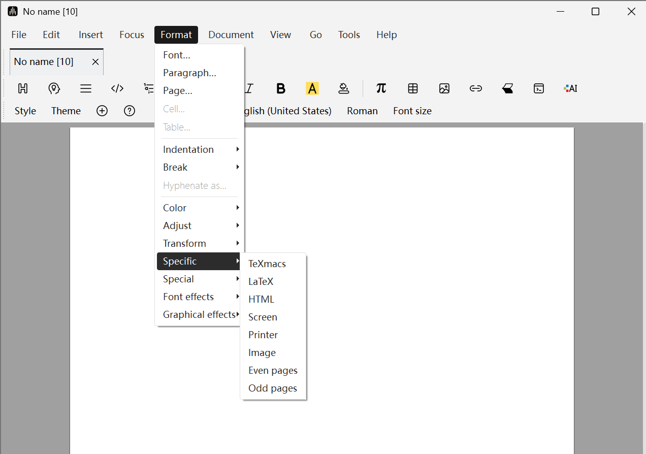
You can make parts of text visible only in specific situations using items in Format -> Specific, as follows:
- Screen: Display content only on screen, not when printing.
- Printer: Display content only when printing to paper, not on screen.
- LaTeX: Display content only when exporting to LaTeX.
- HTML: Display content only when exporting to HTML.
- TeXmacs: Display content except when exporting to other formats.
- Image: Export this content as an image when exporting to other formats.
- Odd pages: Display content only on odd pages, corresponding to right-hand pages in books.
- Even pages: Display content only on even pages, corresponding to left-hand pages in books.
Pattern Repetition
You can create your own text repetitions using Format -> Specific -> Repeat object. The first parameter of the repeat primitive corresponds to the text to which the repetition is applied, and the second parameter contains the object you want to repeat. The specific effect is shown in the figure below:
Font Effects
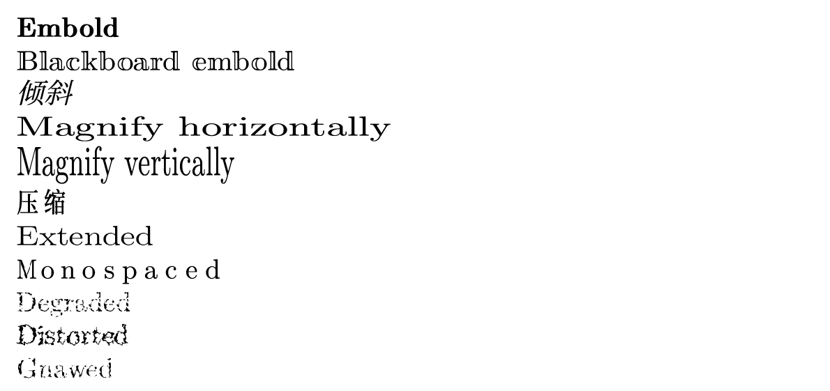
You can select the text effects you need through Format -> Font effects; at the same time, you can adjust the presentation of effects through Focus -> Preferences or fields on the Focus Toolbar. Specific styles include:
- Embold: Bold. Normally increases the thickness of font strokes, making text more prominent.
- Blackboard embold: Blackboard bold. Simulates the bold effect of chalk writing on a blackboard, with edges that may have some irregularity.
- Italic: Makes the font tilt to the right or left, often used to simulate italic style or indicate movement.
- Magnify horizontally: Horizontal magnification. Stretches the font horizontally, making text wider.
- Magnify vertically: Vertical magnification. Stretches the font vertically, making text taller.
- Compress: Opposite of "Extend", compresses the width of the font, making text slender and compact.
- Extended: Extend. Usually refers to increasing the width of characters, making text appear more open.
- Monospaced: Monospaced. Sets the width of each character to be the same, commonly used for code editing or typewriter style, such as Courier font.
- Degraded: Degraded/corroded. Simulates the effect of text being corroded, worn, or partially missing, creating an old, damaged feeling.
- Distorted: Distorted. Applies irregular overall distortion deformation to text, producing shaking, undulating, or melting visual effects.
- Gnawed: Bite marks/gnawed. Simulates the effect of text edges being gnawed, creating jagged gaps.
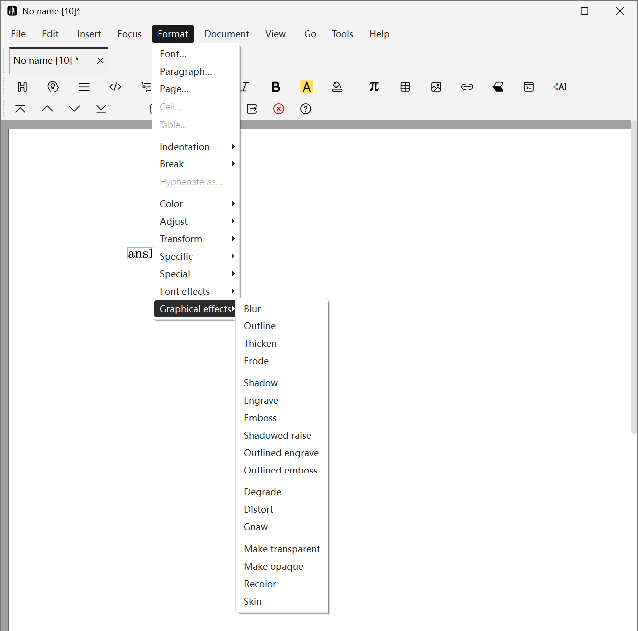
Graphic Effects
Liii STEM also supports graphic effects functionality. Compared to font effects, graphic effects work by first converting the selected text area or image area into a bitmap image, then applying various image processing filters (such as blur, stroke, etc.) to it like processing an image.
Similarly, you can select the text effects you need through Format -> Graphic effects; at the same time, you can adjust the presentation of effects through Focus -> Preferences or fields on the Focus Toolbar.